
In case you’re in a hurry:
- I built a real-time economic dashboard that runs entirely on Cloudflare Workers, with no backend server to manage.
- It pulls live macro data from FRED and market data from Polygon, creating an up-to-date snapshot of economic conditions and market sentiment.
- Instead of dumping raw numbers, it calculates trend scores, interprets key indicators, and even writes a GPT-powered analysis for each forecast horizon.
- The system generates composite scores across growth, stability, momentum, and sentiment, then converts those into forward-looking probabilities.
- It even builds its own volatility proxy when official VIX data isn’t available, so it always has something meaningful to report.
- In short, it’s like having a macro strategist and market analyst living inside a serverless edge function, updating every 15 minutes without needing a break.
I’ve always had a thing for forecasting. Not the vague, hand-wavy kind you hear on cable news, but the type grounded in numbers, logic, and actual data. I enjoy using machine learning to predict the future, and I decided to give it a proper go last year when I started wondering if my composite score system could be used in conjunction with custom moving averages, Z-score analysis, and a little ML magic to get a clearer view of what’s next.
That little thought turned into a full-scale project. The result is a real-time dashboard that runs on Cloudflare’s edge, quietly doing the work of an entire macro research desk. Every 15 minutes it wakes up, pulls the latest numbers, processes the trends, and generates a complete economic outlook, written by a GPT model that never sleeps and never skips leg day.
And yes, it’s embedded right on my website: https://erikabarker.ai/erikas-economic-analysis-dashboard/
A Serverless Brain With an Economist’s Soul
At the heart of this project is a Cloudflare Worker, which is just a small JavaScript function that runs in dozens of data centers all over the world. This means it’s fast, reliable, and requires zero server maintenance. The worker gets triggered either on a schedule or by a user request. When that happens, it fetches new data, builds a snapshot, and either serves it instantly or regenerates the whole thing if the cache has expired.
The economic data comes from FRED, the same API that powers Federal Reserve research dashboards. The market data, including SPY, VIX, sector ETFs, and the US dollar index, comes from Polygon. I pipe all this into a real-time data pipeline that uses Cloudflare’s KV storage for fast caching and low latency.
So what you’re seeing on the front end isn’t a static chart. It’s a live pulse of the economy.
From Data Grab to Data Story
Here’s where the project starts to feel like something more than just another numbers app.
First, it grabs the raw indicators and does some cleaning. It checks if data is fresh, calculates percentage changes, builds moving averages, and handles quirks like weekend delays in the VIX or lags in GDP releases. Then it starts calculating something far more interesting: interpretation.
I wanted the dashboard to answer a bigger question. Not just “What is the inflation rate?” but “Is inflation accelerating or slowing, and what does that mean for risk sentiment and market direction?”
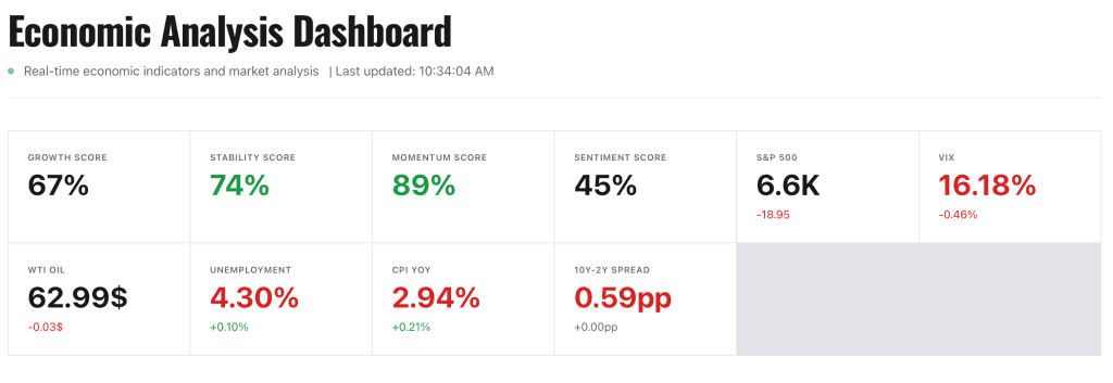
To do that, the script builds a snapshot of key indicators, each with value, delta, and a sparkline showing recent trends. It tracks things like:
- CPI and YoY inflation change
- Unemployment rate
- Real GDP growth, both SAAR and YoY
- Crude oil prices
- S&P 500 trend and volatility (VIX)
- Yield curve inversion (10Y minus 2Y)
It even calculates whether the Fed’s most recent move was a hike or a cut by comparing the current rate band to last month’s.
But the real fun begins when it starts generating scores.
The Composite Score: Like a Macro Brain in a Box
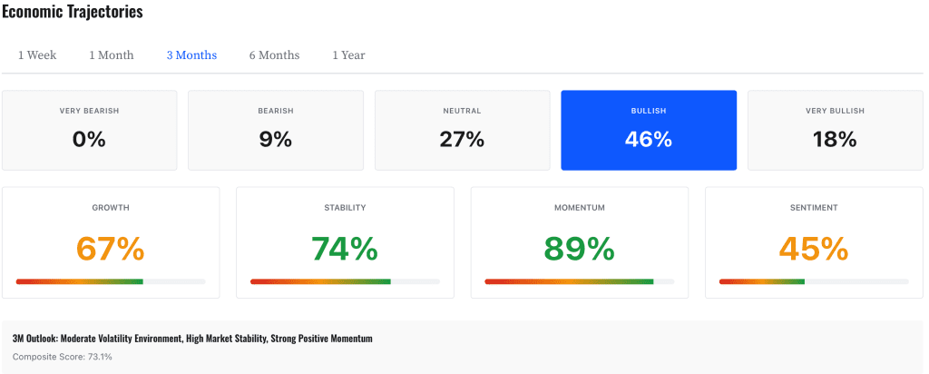
Instead of just showing 15 indicators, the system breaks everything down into four core factor categories:
- Growth – Measures the momentum of the economy, including GDP, industrial production, and employment trends.
- Stability – Assesses inflation, unemployment, and the shape of the yield curve, which is a classic recession predictor.
- Momentum – Tracks market movement, sector rotation, and consumer spending.
- Sentiment – Combines consumer surveys and market volatility to assess emotional temperature.
Each of these scores is scaled between 0 and 1. Neutral is 0.5, and anything above or below indicates how strong or weak that factor is. Then, depending on the forecast horizon, whether we’re looking at one week or one year, the scores are weighted differently.
Short-term forecasts prioritize momentum and sentiment. Long-term forecasts care more about growth and fundamentals.
The result is a composite score for each time horizon. And from that score, the script generates a probability distribution for five outcomes:
- Very Bearish
- Bearish
- Neutral
- Bullish
- Very Bullish
For example, a score of 0.65 might translate into something like: 11 percent Very Bullish, 45 percent Bullish, 33 percent Neutral, 9 percent Bearish, and 2 percent Very Bearish. It gives you a full risk spectrum, not just a binary yes or no.
This is how real portfolio managers think. Nobody bets their money on certainty. They look at probabilities, scenarios, and edge cases. Now, so can you.
Estimating Volatility Like a Mad Scientist
Volatility is where most dashboards fall apart. Everyone wants to show the VIX, but nobody wants to deal with the quirks that come with it.
The VIX is only updated daily, and only after market close. So if you’re pulling data in the morning, you’re probably looking at stale numbers. To fix that, I created a layered volatility model.
Here’s how it works:
- Use FRED VIX if it’s fresh – If the last update is within 24 to 48 hours, we’re good.
- Fallback to Realized Volatility (RV20) – I compute the trailing 20-day standard deviation from SPY returns, then annualize it and multiply by a ratio that accounts for VIX’s implied premium.
- Fallback to VIXY model – If even SPY data fails, the system uses a regression model trained on VIXY to estimate VIX using the ETF’s current price.
No matter what happens, the dashboard always has a volatility reading, and it flags the source so you know if it’s real or estimated.
The volatility level is also categorized into regimes, Low, Moderate, High, or Very High, and those labels are used in the final AI analysis so that the system never says “volatility is high” when it’s actually not.
AI That Doesn’t Hallucinate
Now, this is where things really come together.
After the data is processed and scored, I send it to GPT with a structured prompt that includes:
- The full snapshot of indicators
- The latest values and trends
- Composite score and probability table
- The Fed’s last policy action
- Volatility regime
- And clear instructions on what language is and isn’t allowed
I basically trained GPT to behave like a serious economist. No flattery, no fluff, no vague adjectives. It reads like a proper market brief — short, clear, and grounded in facts.
It outputs a four-part analysis:
- Current Economic State
- Key Trends
- Risk Factors
- Forward Outlook
All of it is consistent with the real numbers. And if GPT can’t be reached, there’s a fallback analysis that still makes use of the scores and indicators.
The analysis is cached in KV storage for an hour, so it doesn’t hit the API every time. If a user changes the forecast horizon, the system fetches a new one.
What This Really Is
At the end of the day, this dashboard is a story engine. It takes thousands of data points and turns them into a readable narrative. It helps me, and hopefully others, understand what’s going on, what’s driving the market, and what to watch next.
It’s 30 percent code, 70 percent financial modeling, and 100 percent curiosity.
I didn’t build it because I had to. I built it because I wanted to see if I could take what I know about markets, machine learning, and edge computing, and wrap it into something that feels alive, like a macroeconomic pulse, constantly updating in the background.
If you’re curious, go check it out. It’s embedded right into my website, no login required, no pitch at the end. Just data, analysis, and a little bit of me in every line of code.